Design Evolution
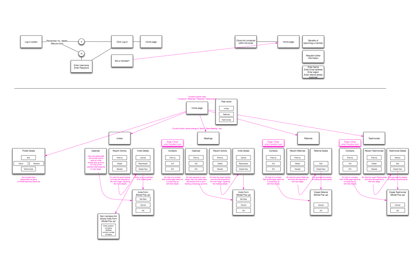
Initial storyboards of the flow were made
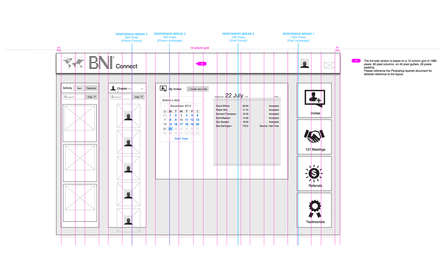
Wireframes of the design were created
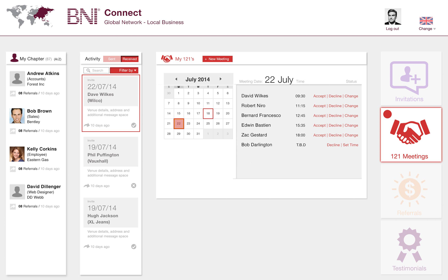
Simple designs brought the wireframes to life
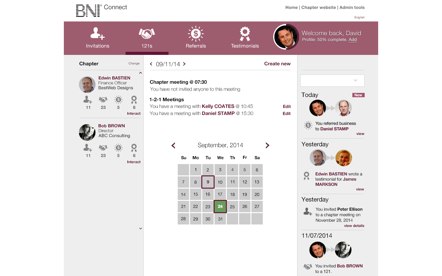
Feedback from client helped changed the design
BNI is a multi-national networking organization that helps its members develop business by personal recommendations. It has 160,000 members worldwide, organized into chapters, and operates in more than 40 countries using a franchise model.
It invested heavily in a suite of management tools build around a web infrastructure with browser-based front end allied to a robust back end. But it found take up was low and development lifecycles lengthy. They wanted something more modern, agile and with the elusive “wow” factor. To them this meant an app.
Our experience told us that for their business an app would add complexity and cost. An online, connected experience that was platform-agnostic and built around an existing product was a more efficient, cost effective option. We suggested they would be better served leveraging their initial investment and moving forward their existing product.
We conducted in-depth interviews with people from all levels of the business in several key territories – from chapter members to franchise operators. We took part in senior strategy sessions to understand the goals of the business moving forward.
We also conducted our own heuristic review into the usability of the existing product.
It quickly became clear to us that there were two distinct cohorts that needed to be supported: The people who operated the business side of BNI, and the members who use it for networking.
And it was the members who were most unhappy and driving the move for a more flexible tool they could use.
We recommended that BNI split their existing front end in two unequal parts, each plugging into the same back-end. Most of the existing tool would be retained as s management system for the operational side of BNI. A standalone product, comprising the five or six functions most used by members to develop their own businesses, would be created to run in parallel. This would be fully responsive, allowing it to be accessed across multiple platforms and form factors.
Such a system, based on the concept of “evolution not revolution” would be relatively quick to market and easier to maintain and develop than a purely native-app strategy. And, because we believe in delighting our customers, we did show them how, if they really, really wanted, our solution could be contained within a light-touch app wrapper and made available via the Apple app store and Google Play.
We were then asked to produce and user-test a prototype.
Initial storyboards of the flow were made

Wireframes of the design were created

Simple designs brought the wireframes to life

Feedback from client helped changed the design

Connected Digital’s prototype proved popular with users on a global scale – with 87% of survey respondents saying they would want to use it on a daily or weekly basis.
It proved an energizing experience for many, convincing them that the business was in touch with them and prepared to listen and react to their requirements.
2010-2025 © Connected Digital Ltd. All Rights Reserved.
Registered in England No: 6341091 | VAT No: 917 3212 43